Analyzing Veros#
Veros makes a very nice output that is relatively easy to analyze. However, it is relatively complex, organized data set, so this document has some pointers to help you get started making calculations using the data it provides.
See also: https://veros.readthedocs.io/en/latest/tutorial/analysis.html
NetCDF and xarray#
Veros outputs its files in Network Common Data Format NetCDF. This is a widely-used portable format that organizes data matrices by co-ordinates. If we do ncdump -h example.snapshot.nc we get entries like:
dimensions:
	xt = 200 ;
	xu = 200 ;
	yt = 4 ;
	yu = 4 ;
	zt = 90 ;
	zw = 90 ;
	tensor1 = 2 ;
	tensor2 = 2 ;
	Time = UNLIMITED ; // (30 currently)
variables:
...
double Time(Time) ;
		string Time:long_name = "Time" ;
		string Time:units = "days" ;
		string Time:time_origin = "01-JAN-1900 00:00:00" ;
...
double u(Time, zt, yt, xu) ;
		u:_FillValue = -1.e+18 ;
		string u:long_name = "Zonal velocity" ;
		string u:units = "m/s" ;
...
double temp(Time, zt, yt, xt) ;
		temp:_FillValue = -1.e+18 ;
		string temp:long_name = "Temperature" ;
		string temp:units = "deg C" ;
...
So, there are x,y,z and Time dimensions, and each of the variables is assigned to one or more of those dimensions. For instance temp is a 4-dimensional variable with the three spatial dimensions and the one time dimension, and represents the evolution of temperature in the model over time.
NetCDF files can be quite large and sometimes cannot be read into memory on one machine. Fortunately the libraries that are written around them are very clever, and allow only parts of the files to be read or written at a time. So in the above, it is entirely possible with the right software to just read into memory one time step of one of the variables, which in this case is 90x4x200 large. Xarray is a very powerful way to work with NetCDF-like data sets and allows very efficient operations on NetCDF files. It is heavily based on numpy, which many students have already used, and also borrows many concepts from pandas. To read a data set into python we can use xarray:
import xarray as xr
import matplotlib.pyplot as plt
import numpy as np
# %matplotlib widget

# This makes it so we don't automatically see data variables.  However you can click on the
# icon next to the variable to see the values if desired.  You don't need to do this; its just
# being done to make the notebook compact:
xr.set_options(display_expand_data=False, display_expand_coords=False, display_expand_attrs=False)
<xarray.core.options.set_options at 0x11a58d550>
with xr.open_dataset('example.snapshot.nc') as ds:
    ds = ds.isel(Time=1)

    ds['vcenter'] = ds.v.rolling(yu=2).mean().swap_dims({'yu':'yt'})
    ds['ucenter'] = ds.u.rolling(xu=2).mean().swap_dims({'xu':'xt'})
    ds['abs_speed'] = (ds.ucenter**2 + ds.vcenter**2)**(0.5)
    abs_speed = (ds.u.values**2 + ds.v.values**2)**(0.5)
    ds['rough_speed'] = (('zt', 'yt', 'xt'), abs_speed)

    ds = ds.isel(yt=1, yu=1)
    fig, axs = plt.subplots(1, 3, sharex=True, sharey=True,
                            layout='constrained', subplot_kw={'facecolor': '0.7'},
                           figsize=(6, 4))
    pc = axs[0].pcolormesh(ds.abs_speed, clim=[-1, 1], cmap='RdBu_r')
    fig.colorbar(pc, extend='both', shrink=0.6, orientation='horizontal')
    axs[0].set_title('speed: centered')

    pc = axs[1].pcolormesh(ds.rough_speed, clim=[-1, 1], cmap='RdBu_r')
    fig.colorbar(pc, extend='both', shrink=0.6, orientation='horizontal')
    axs[1].set_title('speed: rough')
    pc = axs[2].pcolormesh(ds.rough_speed - ds.abs_speed, clim=[-1/10, 1/10], cmap='RdBu_r')
    fig.colorbar(pc, extend='both', shrink=0.6, orientation='horizontal')
    axs[2].set_title('speed: difference')
    axs[2].set_xlim([75, 125])
    axs[2].set_ylim([20, 100])
/var/folders/p1/6grcm4fx3tx_dyzph3cbwk4c0000gn/T/ipykernel_10226/2617613504.py:1: FutureWarning: In a future version, xarray will not decode timedelta values based on the presence of a timedelta-like units attribute by default. Instead it will rely on the presence of a timedelta64 dtype attribute, which is now xarray's default way of encoding timedelta64 values. To continue decoding timedeltas based on the presence of a timedelta-like units attribute, users will need to explicitly opt-in by passing True or CFTimedeltaCoder(decode_via_units=True) to decode_timedelta. To silence this warning, set decode_timedelta to True, False, or a 'CFTimedeltaCoder' instance.
  with xr.open_dataset('example.snapshot.nc') as ds:
with xr.open_dataset('example.snapshot.nc') as ds:
    display(ds)
/var/folders/p1/6grcm4fx3tx_dyzph3cbwk4c0000gn/T/ipykernel_10226/2074390507.py:1: FutureWarning: In a future version, xarray will not decode timedelta values based on the presence of a timedelta-like units attribute by default. Instead it will rely on the presence of a timedelta64 dtype attribute, which is now xarray's default way of encoding timedelta64 values. To continue decoding timedeltas based on the presence of a timedelta-like units attribute, users will need to explicitly opt-in by passing True or CFTimedeltaCoder(decode_via_units=True) to decode_timedelta. To silence this warning, set decode_timedelta to True, False, or a 'CFTimedeltaCoder' instance.
  with xr.open_dataset('example.snapshot.nc') as ds:
<xarray.Dataset> Size: 49MB
Dimensions:            (xt: 200, xu: 200, yt: 4, yu: 4, zt: 90, zw: 90,
                        tensor1: 2, tensor2: 2, Time: 6)
Coordinates: (9)
Data variables: (12/33)
    dxt                (xt) float64 2kB ...
    dxu                (xu) float64 2kB ...
    dyt                (yt) float64 32B ...
    dyu                (yu) float64 32B ...
    dzt                (zt) float64 720B ...
    dzw                (zw) float64 720B ...
    ...                 ...
    kappaM             (Time, zt, yt, xt) float64 3MB ...
    kappaH             (Time, zw, yt, xt) float64 3MB ...
    surface_taux       (Time, yt, xu) float64 38kB ...
    surface_tauy       (Time, yu, xt) float64 38kB ...
    forc_rho_surface   (Time, yt, xt) float64 38kB ...
    psi                (Time, yt, xt) float64 38kB ...
Attributes: (7)Note that in the above, you can click on the triangles to expand or collapse the Data variables or the Coordinates.
As you can see the xarray data set has the same structure as the NetCDF file. In addition it has the concept of Coordinates, which are special variables that correspond to the dimensions.
Each Dataset is composed of one or more DataArrays which often share coordinates and dimensions with other DataArrays in the Dataset.
So in the above temp and salt are DataArrays representing temperature and salinity in the model, and they share the dimensions Time, zt, xt.
display(ds.temp)
display(ds.salt)
<xarray.DataArray 'temp' (Time: 6, zt: 90, yt: 4, xt: 200)> Size: 3MB
[432000 values with dtype=float64]
Coordinates: (4)
Attributes: (2)
<xarray.DataArray 'salt' (Time: 6, zt: 90, yt: 4, xt: 200)> Size: 3MB
[432000 values with dtype=float64]
Coordinates: (4)
Attributes: (2)
Veros coordinates#
The coordinates above are all doubled except for Time, e.g. there is a pair xt and xu. This is because Veros is solved on what is called an Arakawa C-Grid, with the velocities specified on the edges of grid cells that have temperature, salinity, pressure, and other tracers at their centre. See Veros Model Domain for more details, but the diagram looks like:

So, in the above, the variable u has dimensions (Time, zt, yt, xu), v has dimensions (time, zt, yu, xt) and temp has dimensions (Time, zt, yt, xt). The vertical velocity w has dimensions (Time, zw, yt, xt).
Selecting data#
The data set above is probably not too big to fit in memory, but it still may be preferable to select subsets of the data. Xarray makes this realtively straight forward.
Selecting data by dimension index: isel#
The method isel means “index selection”. Suppose I want the 3rd timestep, and I only want a slice of data at the first value of y, then I can use isel and reduce all the variables at the same time:
with xr.open_dataset('example.snapshot.nc') as ds:
    ds = ds.isel(yt=0, yu=0, Time=2)
    display(ds)
/var/folders/p1/6grcm4fx3tx_dyzph3cbwk4c0000gn/T/ipykernel_10226/3257706728.py:1: FutureWarning: In a future version, xarray will not decode timedelta values based on the presence of a timedelta-like units attribute by default. Instead it will rely on the presence of a timedelta64 dtype attribute, which is now xarray's default way of encoding timedelta64 values. To continue decoding timedeltas based on the presence of a timedelta-like units attribute, users will need to explicitly opt-in by passing True or CFTimedeltaCoder(decode_via_units=True) to decode_timedelta. To silence this warning, set decode_timedelta to True, False, or a 'CFTimedeltaCoder' instance.
  with xr.open_dataset('example.snapshot.nc') as ds:
<xarray.Dataset> Size: 2MB
Dimensions:            (xt: 200, xu: 200, zt: 90, zw: 90, tensor1: 2, tensor2: 2)
Coordinates: (9)
Data variables: (12/33)
    dxt                (xt) float64 2kB ...
    dxu                (xu) float64 2kB ...
    dyt                float64 8B ...
    dyu                float64 8B ...
    dzt                (zt) float64 720B ...
    dzw                (zw) float64 720B ...
    ...                 ...
    kappaM             (zt, xt) float64 144kB ...
    kappaH             (zw, xt) float64 144kB ...
    surface_taux       (xu) float64 2kB ...
    surface_tauy       (xt) float64 2kB ...
    forc_rho_surface   (xt) float64 2kB ...
    psi                (xt) float64 2kB ...
Attributes: (7)Compare to the full Dataset above, and note that yt, yu, and time no longer have “Dimension”, which means the are just single valued in this new Dataset.
You can access variables in the Dataset using either a ds.temp or ds['temp'] syntax. Note below that the temp (temperature) variable just has two dimensions associated with it.
display(ds.temp)
<xarray.DataArray 'temp' (zt: 90, xt: 200)> Size: 144kB
[18000 values with dtype=float64]
Coordinates: (5)
Attributes: (2)
You can also specify ranges of variables, so for instance the 3rd to 6th time values. Note that the new variables retain the Time dimension.
with xr.open_dataset('example.snapshot.nc') as ds:
    ds = ds.isel(yt=0, yu=0, Time=range(2,6))
    display(ds)
    display(ds.temp)
/var/folders/p1/6grcm4fx3tx_dyzph3cbwk4c0000gn/T/ipykernel_10226/118823152.py:1: FutureWarning: In a future version, xarray will not decode timedelta values based on the presence of a timedelta-like units attribute by default. Instead it will rely on the presence of a timedelta64 dtype attribute, which is now xarray's default way of encoding timedelta64 values. To continue decoding timedeltas based on the presence of a timedelta-like units attribute, users will need to explicitly opt-in by passing True or CFTimedeltaCoder(decode_via_units=True) to decode_timedelta. To silence this warning, set decode_timedelta to True, False, or a 'CFTimedeltaCoder' instance.
  with xr.open_dataset('example.snapshot.nc') as ds:
<xarray.Dataset> Size: 8MB
Dimensions:            (xt: 200, xu: 200, zt: 90, zw: 90, tensor1: 2,
                        tensor2: 2, Time: 4)
Coordinates: (9)
Data variables: (12/33)
    dxt                (xt) float64 2kB ...
    dxu                (xu) float64 2kB ...
    dyt                float64 8B ...
    dyu                float64 8B ...
    dzt                (zt) float64 720B ...
    dzw                (zw) float64 720B ...
    ...                 ...
    kappaM             (Time, zt, xt) float64 576kB ...
    kappaH             (Time, zw, xt) float64 576kB ...
    surface_taux       (Time, xu) float64 6kB ...
    surface_tauy       (Time, xt) float64 6kB ...
    forc_rho_surface   (Time, xt) float64 6kB ...
    psi                (Time, xt) float64 6kB ...
Attributes: (7)<xarray.DataArray 'temp' (Time: 4, zt: 90, xt: 200)> Size: 576kB [72000 values with dtype=float64] Coordinates: (5) Attributes: (2)
Selecting data by coordinate value: sel#
If you want to work with values of coordinates, rather than indices, that is possible using the sel method. Note here we use slice notation to specify a range in time. np.timedelta64(6, 'h') means 6 hours from the start of the simulation.
with xr.open_dataset('example.snapshot.nc') as ds:
    # get data between 6 and 11 hourse since start of simulation:
    ds = ds.isel(yt=0, yu=0).sel(Time=slice(np.timedelta64(6, 'h'), np.timedelta64(11, 'h')))
    display(ds)
    print(ds.Time.values)
/var/folders/p1/6grcm4fx3tx_dyzph3cbwk4c0000gn/T/ipykernel_10226/3596441218.py:1: FutureWarning: In a future version, xarray will not decode timedelta values based on the presence of a timedelta-like units attribute by default. Instead it will rely on the presence of a timedelta64 dtype attribute, which is now xarray's default way of encoding timedelta64 values. To continue decoding timedeltas based on the presence of a timedelta-like units attribute, users will need to explicitly opt-in by passing True or CFTimedeltaCoder(decode_via_units=True) to decode_timedelta. To silence this warning, set decode_timedelta to True, False, or a 'CFTimedeltaCoder' instance.
  with xr.open_dataset('example.snapshot.nc') as ds:
<xarray.Dataset> Size: 2MB
Dimensions:            (xt: 200, xu: 200, zt: 90, zw: 90, tensor1: 2,
                        tensor2: 2, Time: 1)
Coordinates: (9)
Data variables: (12/33)
    dxt                (xt) float64 2kB ...
    dxu                (xu) float64 2kB ...
    dyt                float64 8B ...
    dyu                float64 8B ...
    dzt                (zt) float64 720B ...
    dzw                (zw) float64 720B ...
    ...                 ...
    kappaM             (Time, zt, xt) float64 144kB ...
    kappaH             (Time, zw, xt) float64 144kB ...
    surface_taux       (Time, xu) float64 2kB ...
    surface_tauy       (Time, xt) float64 2kB ...
    forc_rho_surface   (Time, xt) float64 2kB ...
    psi                (Time, xt) float64 2kB ...
Attributes: (7)[21600000000000]
If we would prefer to just get one time value then that is easy if we choose a co-ordinate value:
with xr.open_dataset('example.snapshot.nc') as ds:
    ds = ds.isel(yt=0, yu=0).sel(Time=np.timedelta64(6, 'h'))
    display(ds)
/var/folders/p1/6grcm4fx3tx_dyzph3cbwk4c0000gn/T/ipykernel_10226/2127632666.py:1: FutureWarning: In a future version, xarray will not decode timedelta values based on the presence of a timedelta-like units attribute by default. Instead it will rely on the presence of a timedelta64 dtype attribute, which is now xarray's default way of encoding timedelta64 values. To continue decoding timedeltas based on the presence of a timedelta-like units attribute, users will need to explicitly opt-in by passing True or CFTimedeltaCoder(decode_via_units=True) to decode_timedelta. To silence this warning, set decode_timedelta to True, False, or a 'CFTimedeltaCoder' instance.
  with xr.open_dataset('example.snapshot.nc') as ds:
<xarray.Dataset> Size: 2MB
Dimensions:            (xt: 200, xu: 200, zt: 90, zw: 90, tensor1: 2, tensor2: 2)
Coordinates: (9)
Data variables: (12/33)
    dxt                (xt) float64 2kB ...
    dxu                (xu) float64 2kB ...
    dyt                float64 8B ...
    dyu                float64 8B ...
    dzt                (zt) float64 720B ...
    dzw                (zw) float64 720B ...
    ...                 ...
    kappaM             (zt, xt) float64 144kB ...
    kappaH             (zw, xt) float64 144kB ...
    surface_taux       (xu) float64 2kB ...
    surface_tauy       (xt) float64 2kB ...
    forc_rho_surface   (xt) float64 2kB ...
    psi                (xt) float64 2kB ...
Attributes: (7)But if we do not choose a value that is exactly in the coordinate we can get an error:
# ignore this "xmode" magic; it just makes the Error message _much_ shorter below
%xmode Minimal

with xr.open_dataset('example.snapshot.nc') as ds:
    # time is 370 minutes, or just a bit off from 6 h where we have data:
    ds = ds.isel(yt=0, yu=0).sel(Time=np.timedelta64(6*60+10, 'm'))
Exception reporting mode: Minimal
/var/folders/p1/6grcm4fx3tx_dyzph3cbwk4c0000gn/T/ipykernel_10226/731390352.py:4: FutureWarning: In a future version, xarray will not decode timedelta values based on the presence of a timedelta-like units attribute by default. Instead it will rely on the presence of a timedelta64 dtype attribute, which is now xarray's default way of encoding timedelta64 values. To continue decoding timedeltas based on the presence of a timedelta-like units attribute, users will need to explicitly opt-in by passing True or CFTimedeltaCoder(decode_via_units=True) to decode_timedelta. To silence this warning, set decode_timedelta to True, False, or a 'CFTimedeltaCoder' instance.
  with xr.open_dataset('example.snapshot.nc') as ds:
KeyError: "not all values found in index 'Time'. Try setting the `method` keyword argument (example: method='nearest')."
In this case we can still proceed using the error message above as guidance:
with xr.open_dataset('example.snapshot.nc') as ds:
    # time is 370 minutes, or just a bit off from 6 h where we have data:
    ds = ds.isel(yt=0, yu=0).sel(Time=np.timedelta64(6*60+10, 'm'), method='nearest')
    display(ds)
/var/folders/p1/6grcm4fx3tx_dyzph3cbwk4c0000gn/T/ipykernel_10226/666103902.py:1: FutureWarning: In a future version, xarray will not decode timedelta values based on the presence of a timedelta-like units attribute by default. Instead it will rely on the presence of a timedelta64 dtype attribute, which is now xarray's default way of encoding timedelta64 values. To continue decoding timedeltas based on the presence of a timedelta-like units attribute, users will need to explicitly opt-in by passing True or CFTimedeltaCoder(decode_via_units=True) to decode_timedelta. To silence this warning, set decode_timedelta to True, False, or a 'CFTimedeltaCoder' instance.
  with xr.open_dataset('example.snapshot.nc') as ds:
<xarray.Dataset> Size: 2MB
Dimensions:            (xt: 200, xu: 200, zt: 90, zw: 90, tensor1: 2, tensor2: 2)
Coordinates: (9)
Data variables: (12/33)
    dxt                (xt) float64 2kB ...
    dxu                (xu) float64 2kB ...
    dyt                float64 8B ...
    dyu                float64 8B ...
    dzt                (zt) float64 720B ...
    dzw                (zw) float64 720B ...
    ...                 ...
    kappaM             (zt, xt) float64 144kB ...
    kappaH             (zw, xt) float64 144kB ...
    surface_taux       (xu) float64 2kB ...
    surface_tauy       (xt) float64 2kB ...
    forc_rho_surface   (xt) float64 2kB ...
    psi                (xt) float64 2kB ...
Attributes: (7)Notice that the Time that gets chosen in 06:00:00. Of course you can do the same selection mechanisms with other coordinates.
Dealing with staggered grids#
The staggering of the variable locations (mentioned above), sometime doesn’t matter, but it is good to keep track of. It is also the source of a potential pitfall when using xarray. If the dimensions of two variables do not match, unexpected things can happen. For instance, its not terribly useful, but imagine we wanted to get the speed from the u and v values. We might naively do this, forgetting that the dimensions are different:
with xr.open_dataset('example.snapshot.nc') as ds:
    ds = ds.isel(Time=2)
    abs_speed = (ds.u**2 + ds.v**2)**(0.5)
    display(abs_speed)
/var/folders/p1/6grcm4fx3tx_dyzph3cbwk4c0000gn/T/ipykernel_10226/301387432.py:1: FutureWarning: In a future version, xarray will not decode timedelta values based on the presence of a timedelta-like units attribute by default. Instead it will rely on the presence of a timedelta64 dtype attribute, which is now xarray's default way of encoding timedelta64 values. To continue decoding timedeltas based on the presence of a timedelta-like units attribute, users will need to explicitly opt-in by passing True or CFTimedeltaCoder(decode_via_units=True) to decode_timedelta. To silence this warning, set decode_timedelta to True, False, or a 'CFTimedeltaCoder' instance.
  with xr.open_dataset('example.snapshot.nc') as ds:
<xarray.DataArray (zt: 90, yt: 4, xu: 200, yu: 4, xt: 200)> Size: 461MB
0.000186 0.000186 0.000186 0.000186 0.000186 0.000186 ... nan nan nan nan nan
Coordinates: (6)
Note that this new DataArray has three dimensions, whereas we almost certaily wanted it to just have two. Note that the new data array is also much larger than expected!
Averaging to common coordinates#
The right way to add together the data on different coordinates is to average both onto the center of the cells, which is possible directly in xarray:
ds['ucenter'] = ds.u.rolling(xu=2, center=True).mean().swap_dims({'xu':'xt'})
display(ds.ucenter)
<xarray.DataArray 'ucenter' (zt: 90, yt: 4, xt: 200)> Size: 576kB
nan -0.0002765 -0.0004525 -0.000617 ... -0.0006121 -0.0004488 -0.0002741 nan
Coordinates: (4)
Attributes: (2)
Note there were three steps to to this process 1) create a rolling object in the xu dimension, and then 2) take the mean. 3) The dimensions of the new object are still xu. We can assign the dimensions as xt instead using swap_dims.
Now when we calculate the speed, the dimesnions match:
ds['vcenter'] = ds.v.rolling(yu=2).mean().swap_dims({'yu':'yt'})
abs_speed = (ds.ucenter**2 + ds.vcenter**2)**(0.5)
display(abs_speed)
<xarray.DataArray (zt: 90, yt: 4, xt: 200)> Size: 576kB
nan nan nan nan nan nan nan nan nan nan ... nan nan nan nan nan nan nan nan nan
Coordinates: (4)
Ignoring coordinates:#
If we are not concerned with accuracy, we can also cheat and just use the values of the arrays and create a new variable:
with xr.open_dataset('example.snapshot.nc') as ds:
    ds = ds.isel(Time=2)
    abs_speed = (ds.u.values**2 + ds.v.values**2)**(0.5)
    display(abs_speed)
/var/folders/p1/6grcm4fx3tx_dyzph3cbwk4c0000gn/T/ipykernel_10226/3003441333.py:1: FutureWarning: In a future version, xarray will not decode timedelta values based on the presence of a timedelta-like units attribute by default. Instead it will rely on the presence of a timedelta64 dtype attribute, which is now xarray's default way of encoding timedelta64 values. To continue decoding timedeltas based on the presence of a timedelta-like units attribute, users will need to explicitly opt-in by passing True or CFTimedeltaCoder(decode_via_units=True) to decode_timedelta. To silence this warning, set decode_timedelta to True, False, or a 'CFTimedeltaCoder' instance.
  with xr.open_dataset('example.snapshot.nc') as ds:
array([[[0.00018602, 0.00036691, 0.00053812, ..., 0.0003659 ,
         0.00018552,        nan],
        [0.00018602, 0.00036691, 0.00053812, ..., 0.0003659 ,
         0.00018552,        nan],
        [0.00018602, 0.00036691, 0.00053812, ..., 0.0003659 ,
         0.00018552,        nan],
        [       nan,        nan,        nan, ...,        nan,
                nan,        nan]],

       [[0.00018602, 0.0003669 , 0.00053812, ..., 0.00036589,
         0.00018552,        nan],
        [0.00018602, 0.0003669 , 0.00053812, ..., 0.00036589,
         0.00018552,        nan],
        [0.00018602, 0.0003669 , 0.00053812, ..., 0.00036589,
         0.00018552,        nan],
        [       nan,        nan,        nan, ...,        nan,
                nan,        nan]],

       [[0.00018602, 0.00036689, 0.00053808, ..., 0.00036588,
         0.00018552,        nan],
        [0.00018602, 0.00036689, 0.00053808, ..., 0.00036588,
         0.00018552,        nan],
        [0.00018602, 0.00036689, 0.00053808, ..., 0.00036588,
         0.00018552,        nan],
        [       nan,        nan,        nan, ...,        nan,
                nan,        nan]],

       ...,

       [[0.00018613, 0.00036707, 0.00053828, ..., 0.0003656 ,
         0.00018537,        nan],
        [0.00018613, 0.00036707, 0.00053828, ..., 0.0003656 ,
         0.00018537,        nan],
        [0.00018613, 0.00036707, 0.00053828, ..., 0.0003656 ,
         0.00018537,        nan],
        [       nan,        nan,        nan, ...,        nan,
                nan,        nan]],

       [[0.00018642, 0.0003676 , 0.000539  , ..., 0.00036512,
         0.00018511,        nan],
        [0.00018642, 0.0003676 , 0.000539  , ..., 0.00036512,
         0.00018511,        nan],
        [0.00018642, 0.0003676 , 0.000539  , ..., 0.00036512,
         0.00018511,        nan],
        [       nan,        nan,        nan, ...,        nan,
                nan,        nan]],

       [[0.0001875 , 0.00036966, 0.00054188, ..., 0.0003638 ,
         0.0001844 ,        nan],
        [0.0001875 , 0.00036966, 0.00054188, ..., 0.0003638 ,
         0.0001844 ,        nan],
        [0.0001875 , 0.00036966, 0.00054188, ..., 0.0003638 ,
         0.0001844 ,        nan],
        [       nan,        nan,        nan, ...,        nan,
                nan,        nan]]], shape=(90, 4, 200))
Note that this is just a numpy array - if we want to make part of the Dataset we can just assign coordinates
with xr.open_dataset('example.snapshot.nc') as ds:
    ds = ds.isel(Time=2)
    ds['rough_speed'] = (('zt', 'yt', 'xt'), abs_speed)
    display(ds.rough_speed)
/var/folders/p1/6grcm4fx3tx_dyzph3cbwk4c0000gn/T/ipykernel_10226/3023897792.py:1: FutureWarning: In a future version, xarray will not decode timedelta values based on the presence of a timedelta-like units attribute by default. Instead it will rely on the presence of a timedelta64 dtype attribute, which is now xarray's default way of encoding timedelta64 values. To continue decoding timedeltas based on the presence of a timedelta-like units attribute, users will need to explicitly opt-in by passing True or CFTimedeltaCoder(decode_via_units=True) to decode_timedelta. To silence this warning, set decode_timedelta to True, False, or a 'CFTimedeltaCoder' instance.
  with xr.open_dataset('example.snapshot.nc') as ds:
<xarray.DataArray 'rough_speed' (zt: 90, yt: 4, xt: 200)> Size: 576kB
0.000186 0.0003669 0.0005381 0.0006959 0.0008377 ... nan nan nan nan nan
Coordinates: (4)
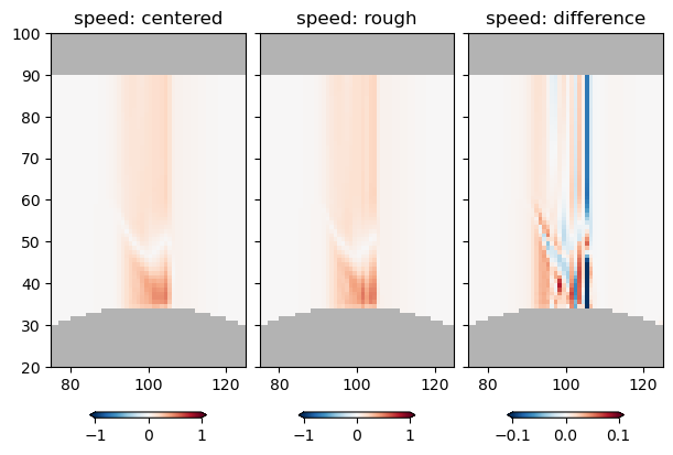
For fun, lets compare the two estimates along one slice in y:
with xr.open_dataset('example.snapshot.nc') as ds:
    ds = ds.isel(Time=2)

    ds['vcenter'] = ds.v.rolling(yu=2).mean().swap_dims({'yu':'yt'})
    ds['ucenter'] = ds.u.rolling(xu=2).mean().swap_dims({'xu':'xt'})
    ds['abs_speed'] = (ds.ucenter**2 + ds.vcenter**2)**(0.5)

    ds['rough_speed'] = (('zt', 'yt', 'xt'), abs_speed)
    ds = ds.isel(yt=1, yu=1)
    fig, axs = plt.subplots(1, 3, sharex=True, sharey=True,
                            layout='constrained', subplot_kw={'facecolor': '0.7'},
                           figsize=(6, 4))
    pc = axs[0].pcolormesh(ds.abs_speed, clim=[-1, 1], cmap='RdBu_r')
    fig.colorbar(pc, extend='both', shrink=0.6, orientation='horizontal')
    axs[0].set_title('speed: centered')

    pc = axs[1].pcolormesh(ds.rough_speed, clim=[-1, 1], cmap='RdBu_r')
    fig.colorbar(pc, extend='both', shrink=0.6, orientation='horizontal')
    axs[1].set_title('speed: rough')
    pc = axs[2].pcolormesh(ds.rough_speed - ds.abs_speed, clim=[-1/10, 1/10], cmap='RdBu_r')
    fig.colorbar(pc, extend='both', shrink=0.6, orientation='horizontal')
    axs[2].set_title('speed: difference')
    axs[2].set_xlim([75, 125])
    axs[2].set_ylim([20, 100])
/var/folders/p1/6grcm4fx3tx_dyzph3cbwk4c0000gn/T/ipykernel_10226/2614056014.py:1: FutureWarning: In a future version, xarray will not decode timedelta values based on the presence of a timedelta-like units attribute by default. Instead it will rely on the presence of a timedelta64 dtype attribute, which is now xarray's default way of encoding timedelta64 values. To continue decoding timedeltas based on the presence of a timedelta-like units attribute, users will need to explicitly opt-in by passing True or CFTimedeltaCoder(decode_via_units=True) to decode_timedelta. To silence this warning, set decode_timedelta to True, False, or a 'CFTimedeltaCoder' instance.
  with xr.open_dataset('example.snapshot.nc') as ds:
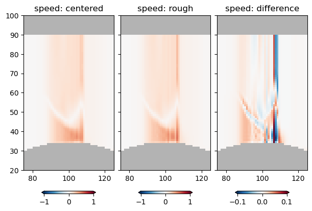
So there is some difference, but its maybe only noticable where there are sharp, poorly resolved parts of the velocity field.
Dealing with time#
You would think time would be straight forward - it rarely is.
Veros stores time in the Netcdf files in floating-point days since the start of the simulation. If you look at the default time values returned by xarray, it converts them to nanoseconds. I deal with this a few ways. Simplest is to convert back to days or hours:
with xr.open_dataset('example.snapshot.nc') as ds:
    print(ds.Time.values)
    ds['Time'] = ds.Time / np.timedelta64(1, 'h')
    print('Hours', ds.Time.values)

with xr.open_dataset('example.snapshot.nc') as ds:
    ds['Time'] = ds.Time / np.timedelta64(1, 'D')
    print('Days', ds.Time.values)
[ 3600000000000  7200000000000 10800000000000 14400000000000
 18000000000000 21600000000000]
Hours [1. 2. 3. 4. 5. 6.]
Days [0.04166667 0.08333333 0.125      0.16666667 0.20833333 0.25      ]
/var/folders/p1/6grcm4fx3tx_dyzph3cbwk4c0000gn/T/ipykernel_10226/3923029065.py:1: FutureWarning: In a future version, xarray will not decode timedelta values based on the presence of a timedelta-like units attribute by default. Instead it will rely on the presence of a timedelta64 dtype attribute, which is now xarray's default way of encoding timedelta64 values. To continue decoding timedeltas based on the presence of a timedelta-like units attribute, users will need to explicitly opt-in by passing True or CFTimedeltaCoder(decode_via_units=True) to decode_timedelta. To silence this warning, set decode_timedelta to True, False, or a 'CFTimedeltaCoder' instance.
  with xr.open_dataset('example.snapshot.nc') as ds:
/var/folders/p1/6grcm4fx3tx_dyzph3cbwk4c0000gn/T/ipykernel_10226/3923029065.py:6: FutureWarning: In a future version, xarray will not decode timedelta values based on the presence of a timedelta-like units attribute by default. Instead it will rely on the presence of a timedelta64 dtype attribute, which is now xarray's default way of encoding timedelta64 values. To continue decoding timedeltas based on the presence of a timedelta-like units attribute, users will need to explicitly opt-in by passing True or CFTimedeltaCoder(decode_via_units=True) to decode_timedelta. To silence this warning, set decode_timedelta to True, False, or a 'CFTimedeltaCoder' instance.
  with xr.open_dataset('example.snapshot.nc') as ds:
This will almost always be appropriate for our needs. However, xarray forcing to nanoseconds has a big drawback for some of our longer simulations - after 292 years we run out of nanoseconds, and the numbers wrap! To get around this, we just use decode_timedelta=False. Note that the resulting Time is now a float and has units “days”.
with xr.open_dataset('example.snapshot.nc', decode_timedelta=False) as ds:
    display(ds.Time)
    display(ds.Time.attrs)
<xarray.DataArray 'Time' (Time: 6)> Size: 48B
0.04167 0.08333 0.125 0.1667 0.2083 0.25
Coordinates: (1)
Attributes: (3)
{'long_name': 'Time', 'units': 'days', 'time_origin': '01-JAN-1900 00:00:00'}
Plotting and secondary calculations with data#
We saw an example of plotting data above. Ideally you have been exposed to data presentation techniques in other classes.
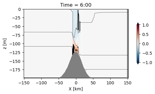
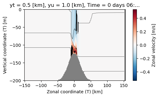
If you are using xarray you will likely use Matplotlib for data visualization. As in the example above, this usually consists of taking a slice of data and plotting with contour or pcolormesh. As an example that gets used a lot, lets use pcolormesh for velocity, and contour the temperature field over top:
Raw matplotlib:#
with xr.open_dataset('example.snapshot.nc') as ds:
    # choose a time slice, and one value of yu and yt:
    ds = ds.isel(Time=5, yu=1, yt=1)

    fig, ax = plt.subplots(layout='constrained', figsize=(5, 3))
    #make the background grey
    ax.set_facecolor('0.5')

    pc = ax.pcolormesh(ds.xt, ds.zw, ds.u[1:, 1:], clim=[-1, 1], cmap='RdBu_r')
    ax.contour(ds.xt, ds.zt, ds.temp, levels=np.arange(10, 20, 2), colors='k', linewidths=0.4)

    # label:
    ax.set_xlabel('X [km]')
    ax.set_ylabel('z [m]')

    # make a colorbar
    fig.colorbar(pc, shrink=0.6, extend='both')

    # convert time to hours:
    hours = int(ds.Time.values/ np.timedelta64(1, 'h'))
    ax.set_title(f'Time = {hours}:00')
/var/folders/p1/6grcm4fx3tx_dyzph3cbwk4c0000gn/T/ipykernel_10226/752327129.py:1: FutureWarning: In a future version, xarray will not decode timedelta values based on the presence of a timedelta-like units attribute by default. Instead it will rely on the presence of a timedelta64 dtype attribute, which is now xarray's default way of encoding timedelta64 values. To continue decoding timedeltas based on the presence of a timedelta-like units attribute, users will need to explicitly opt-in by passing True or CFTimedeltaCoder(decode_via_units=True) to decode_timedelta. To silence this warning, set decode_timedelta to True, False, or a 'CFTimedeltaCoder' instance.
  with xr.open_dataset('example.snapshot.nc') as ds:
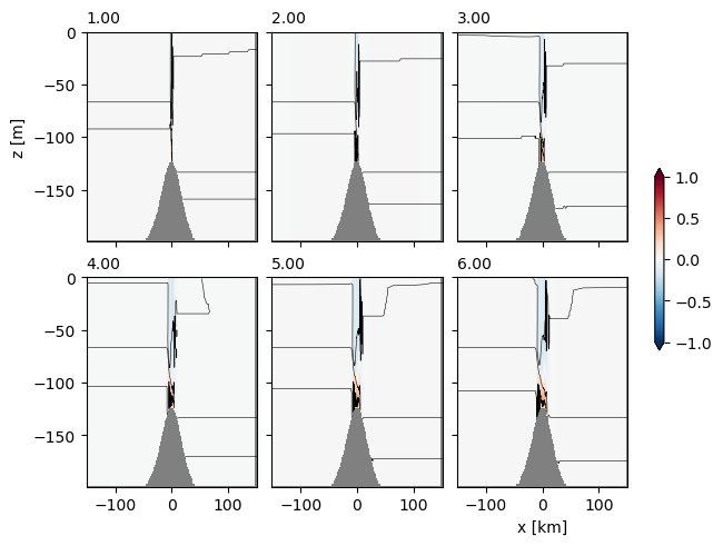
Sometimes it is nice to do lots of time slices, which is relatively straight forward. Note that to do this in a loop we use enumerate to get the index of the time we are on:
with xr.open_dataset('example.snapshot.nc') as ds0:
    # choose a time slice, and one value of yu and yt:
    ds0 = ds0.isel(yu=1, yt=1)
    fig, axs = plt.subplots(2, 3, layout='constrained',
                            subplot_kw={'facecolor':'0.7'},
                           sharex=True, sharey=True)

    # range(0, 6) returns 0, 1, 2,...5 eg the first 6 slices of the simulation.
    # enumerate() is useful if your time slices are not integers, so
    # nn, let = enumerate(['a', 'b', 'c']) returns nn=0, let='a'; nn=1, let='b';
    # nn=2, let='c':
    for nn, time in enumerate(range(0, 6)):
        # choose time slice by index:
        ds = ds0.isel(Time=time)
        # choose the nn-th axes:
        ax = axs.flat[nn]

        #make the background grey
        ax.set_facecolor('0.5')

        pc = ax.pcolormesh(ds.xt, ds.zw, ds.u[1:, 1:], clim=[-1, 1], cmap='RdBu_r')
        ax.contour(ds.xt, ds.zt, ds.temp, levels=np.arange(10, 20, 2), colors='k', linewidths=0.4)

        # convert Time in nanoseconds to floating ploint hours:
        hours = ds.Time.values/ np.timedelta64(1, 'h')
        ax.set_title(f'{hours:1.2f}', fontsize='medium', loc='left')

    # label the outside axes:

    axs[0, 0].set_ylabel('z [m]')
    axs[1, 2].set_xlabel('x [km]')
    # make a colorbar for all at once:
    fig.colorbar(pc, ax=axs, shrink=0.4, extend='both')
/var/folders/p1/6grcm4fx3tx_dyzph3cbwk4c0000gn/T/ipykernel_10226/2129303638.py:1: FutureWarning: In a future version, xarray will not decode timedelta values based on the presence of a timedelta-like units attribute by default. Instead it will rely on the presence of a timedelta64 dtype attribute, which is now xarray's default way of encoding timedelta64 values. To continue decoding timedeltas based on the presence of a timedelta-like units attribute, users will need to explicitly opt-in by passing True or CFTimedeltaCoder(decode_via_units=True) to decode_timedelta. To silence this warning, set decode_timedelta to True, False, or a 'CFTimedeltaCoder' instance.
  with xr.open_dataset('example.snapshot.nc') as ds0:
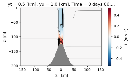
Xarray plotting helpers#
Xarray have some short cuts for plotting data. These can work well, particularly for a quick look, but lack some of the flexibility of the Matplotlib plotting:
with xr.open_dataset('example.snapshot.nc') as ds:
    # choose a time slice, and one value of yu and yt:
    ds = ds.isel(Time=5, yu=1, yt=1)

    fig, ax = plt.subplots(layout='constrained', figsize=(5, 3))
    #make the background grey
    ax.set_facecolor('0.5')

    ds.u.plot.pcolormesh(clim=[-1, 1])
    ds.temp.plot.contour(levels=np.arange(10, 20, 2), colors='k', linewidths=0.4)
/var/folders/p1/6grcm4fx3tx_dyzph3cbwk4c0000gn/T/ipykernel_10226/508949417.py:1: FutureWarning: In a future version, xarray will not decode timedelta values based on the presence of a timedelta-like units attribute by default. Instead it will rely on the presence of a timedelta64 dtype attribute, which is now xarray's default way of encoding timedelta64 values. To continue decoding timedeltas based on the presence of a timedelta-like units attribute, users will need to explicitly opt-in by passing True or CFTimedeltaCoder(decode_via_units=True) to decode_timedelta. To silence this warning, set decode_timedelta to True, False, or a 'CFTimedeltaCoder' instance.
  with xr.open_dataset('example.snapshot.nc') as ds:
This is perfectly acceptable; note how xarray makes the labels for us, which is quite convenient. You probably would not want to publish a plot like this, but could be fine.
Note a trick is that if you don’t like ‘Zonal coordinate (T) [km]’, you can go ahead and change the attributes - its a bit silly to do so here, but if you develop a processing script for your xarray data you could easily do this every time you load a data set.
with xr.open_dataset('example.snapshot.nc') as ds:
    # choose a time slice, and one value of yu and yt:
    ds = ds.isel(Time=5, yu=1, yt=1)
    ds.xu.attrs['long_name'] = '$X_u$'
    ds.xt.attrs['long_name'] = '$X_t$'
    ds.zt.attrs['long_name'] = '$z_t$'
    ds.zw.attrs['long_name'] = '$z_w$'
    ds.u.attrs['long_name'] = 'U'
    ds.u.attrs['units'] = '$m\,s^{-1}$'

    fig, ax = plt.subplots(layout='constrained', figsize=(5, 3))
    #make the background grey
    ax.set_facecolor('0.5')

    ds.u.plot.pcolormesh(clim=[-1, 1])
    ds.temp.plot.contour(levels=np.arange(10, 20, 2), colors='k', linewidths=0.4)
<>:9: SyntaxWarning: invalid escape sequence '\,'
<>:9: SyntaxWarning: invalid escape sequence '\,'
/var/folders/p1/6grcm4fx3tx_dyzph3cbwk4c0000gn/T/ipykernel_10226/572192793.py:9: SyntaxWarning: invalid escape sequence '\,'
  ds.u.attrs['units'] = '$m\,s^{-1}$'
/var/folders/p1/6grcm4fx3tx_dyzph3cbwk4c0000gn/T/ipykernel_10226/572192793.py:1: FutureWarning: In a future version, xarray will not decode timedelta values based on the presence of a timedelta-like units attribute by default. Instead it will rely on the presence of a timedelta64 dtype attribute, which is now xarray's default way of encoding timedelta64 values. To continue decoding timedeltas based on the presence of a timedelta-like units attribute, users will need to explicitly opt-in by passing True or CFTimedeltaCoder(decode_via_units=True) to decode_timedelta. To silence this warning, set decode_timedelta to True, False, or a 'CFTimedeltaCoder' instance.
  with xr.open_dataset('example.snapshot.nc') as ds:
Integration#
Often we will want to integrate something. Suppose for the above we want to get an estimate of the heat content:
where \(\rho = 1000 \ \mathrm{kg\,m^{-3}}\) is the density of water, \(c_p = 4000\ \mathrm{J/(kg K)}\) is the heat capacity of seawater, and \(Q\) has units of \(J\,m^{-2}\) and is a density of heat content per area in the horizontal direction.
with xr.open_dataset('example.snapshot.nc') as ds:
    # choose a time slice, and one value of yu and yt:
    ds = ds.isel(Time=5, yu=1, yt=1)
    rho = 1000  # kg/m^3
    cp = 4000  # J / (kg K)
    heat = (ds.temp+273).integrate(coord='zt') * cp * rho

    display(heat)
    fig, ax = plt.subplots()
    ax.plot(heat.xt, heat)
/var/folders/p1/6grcm4fx3tx_dyzph3cbwk4c0000gn/T/ipykernel_10226/4255449133.py:1: FutureWarning: In a future version, xarray will not decode timedelta values based on the presence of a timedelta-like units attribute by default. Instead it will rely on the presence of a timedelta64 dtype attribute, which is now xarray's default way of encoding timedelta64 values. To continue decoding timedeltas based on the presence of a timedelta-like units attribute, users will need to explicitly opt-in by passing True or CFTimedeltaCoder(decode_via_units=True) to decode_timedelta. To silence this warning, set decode_timedelta to True, False, or a 'CFTimedeltaCoder' instance.
  with xr.open_dataset('example.snapshot.nc') as ds:
<xarray.DataArray 'temp' (xt: 200)> Size: 2kB
2.249e+11 2.249e+11 2.249e+11 2.249e+11 ... 2.26e+11 2.26e+11 2.26e+11 2.26e+11
Coordinates: (4)
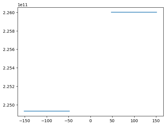
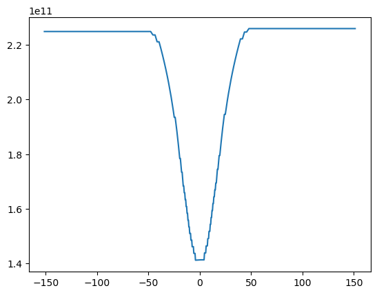
So, we see above that this probably worked, but that there is an error in that there are many nan values that occured because we integrated into the topography. Rather than trying to do something fancy, a reasonable approach is just to replace the nan in the original temp variable by zeros:
with xr.open_dataset('example.snapshot.nc') as ds:
    # choose a time slice, and one value of yu and yt:
    ds = ds.isel(Time=5, yu=1, yt=1)
    rho = 1000  # kg/m^3
    cp = 4000  # J / (kg K)
    temp=(ds.temp+273).fillna(0)

    heat = temp.integrate(coord='zt') * cp * rho

    display(heat)
/var/folders/p1/6grcm4fx3tx_dyzph3cbwk4c0000gn/T/ipykernel_10226/3093189093.py:1: FutureWarning: In a future version, xarray will not decode timedelta values based on the presence of a timedelta-like units attribute by default. Instead it will rely on the presence of a timedelta64 dtype attribute, which is now xarray's default way of encoding timedelta64 values. To continue decoding timedeltas based on the presence of a timedelta-like units attribute, users will need to explicitly opt-in by passing True or CFTimedeltaCoder(decode_via_units=True) to decode_timedelta. To silence this warning, set decode_timedelta to True, False, or a 'CFTimedeltaCoder' instance.
  with xr.open_dataset('example.snapshot.nc') as ds:
<xarray.DataArray 'temp' (xt: 200)> Size: 2kB
2.249e+11 2.249e+11 2.249e+11 2.249e+11 ... 2.26e+11 2.26e+11 2.26e+11 2.26e+11
Coordinates: (4)
fig, ax = plt.subplots()
ax.plot(heat.xt, heat)
[<matplotlib.lines.Line2D at 0x128bda0d0>]
Differentiation#
Xarray also has a differentiation method. The value \(-\frac{1}{\rho}dP/dx\) is used quite often. Note that in Veros, the density is broken into an interior component, p_hydro and a component due to the surface tilt psi. The dynamical quantity is really P/\rho so Veros stores the variables in these units (\(\mathrm{m^2\,s^{-2}}\)). Note that \(-\frac{1}{\rho}dP/dx\) has units of acceleration and is the pressure gradient force.
with xr.open_dataset('example.snapshot.nc') as ds:
    # choose a time slice, and one value of yu and yt:
    ds = ds.isel(Time=5, yu=1, yt=1)

    dpdx = -ds.p_hydro.differentiate(coord='xt')
    dpsidx = -ds.psi.differentiate(coord='xt')
    display(dpdx)
    fig, axs = plt.subplots(2, 1, layout='constrained', sharex=True, sharey=True)
    ax = axs[0]
    ax.set_facecolor('0.5')
    dpdx.plot.pcolormesh(ax=axs[0], vmin=-0.05, vmax=0.05, cmap='RdBu_r')
    ax.set_title('internal pressure gradient')

    ax = axs[1]
    ax.set_facecolor('0.5')
    (dpdx+dpsidx).plot.pcolormesh(ax=axs[1], vmin=-0.05, vmax=0.05, cmap='RdBu_r')
    ax.set_title('internal pressure gradient and external')
/var/folders/p1/6grcm4fx3tx_dyzph3cbwk4c0000gn/T/ipykernel_10226/145886269.py:1: FutureWarning: In a future version, xarray will not decode timedelta values based on the presence of a timedelta-like units attribute by default. Instead it will rely on the presence of a timedelta64 dtype attribute, which is now xarray's default way of encoding timedelta64 values. To continue decoding timedeltas based on the presence of a timedelta-like units attribute, users will need to explicitly opt-in by passing True or CFTimedeltaCoder(decode_via_units=True) to decode_timedelta. To silence this warning, set decode_timedelta to True, False, or a 'CFTimedeltaCoder' instance.
  with xr.open_dataset('example.snapshot.nc') as ds:
<xarray.DataArray 'p_hydro' (zt: 90, xt: 200)> Size: 144kB
-2.219e-08 -2.537e-08 -3.084e-08 -2.792e-08 ... 6.678e-08 4.671e-08 3.327e-08
Coordinates: (5)
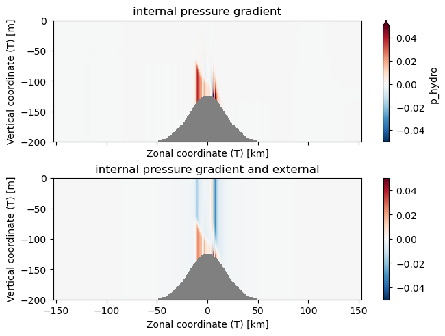
Note the stripe in the plot above are due to discretiztion errors, and are a fundamental limitation of working on a grid with numerical methods.
Final notes#
Sometimes dealing with these data sets is frustrating, and takes a bit of experimentation to get things to work. If you have trouble, ask a class mate, or the instructor - don’t bang your head against a wall for too long.